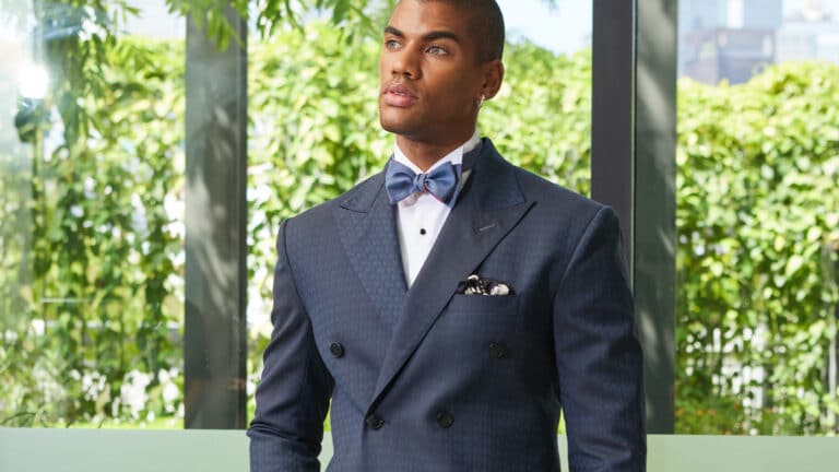
Finding the right fabrics for your next suit can take effort. For most people, having a versatile suit is crucial. That usually means they will stick with a non-patterned fabric and opt for classic colours like blue or grey. However, you can still create a unique look that speaks volumes about yourself by finding the right lining fabric to match a classic suit. Here are some suggestions to help you pair them well, without looking over the top.

Colour wheels show which colours are contrasting or complementary to your chosen colour palette.
Pick a complementary colour
Start with the base colours in your suit. A colour shows you which are the colour ranges that complement your palette. These appear on the opposite side of the colour wheel. For example, reds complement greens, and blue complements yellow and brown. When it comes to picking a suit or lining fabric that compliments each other, use the colour wheel as a basis to narrow down your selection.
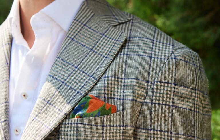
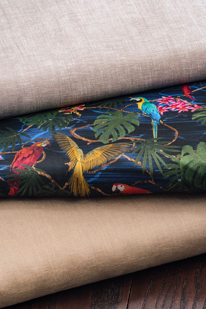
A secondary colour in our Vail OP 120 lining fabric matches well with Amber Rush OP 1922. Image courtesy of Namrata Dogra.
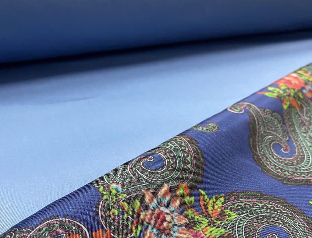
Use a secondary colour
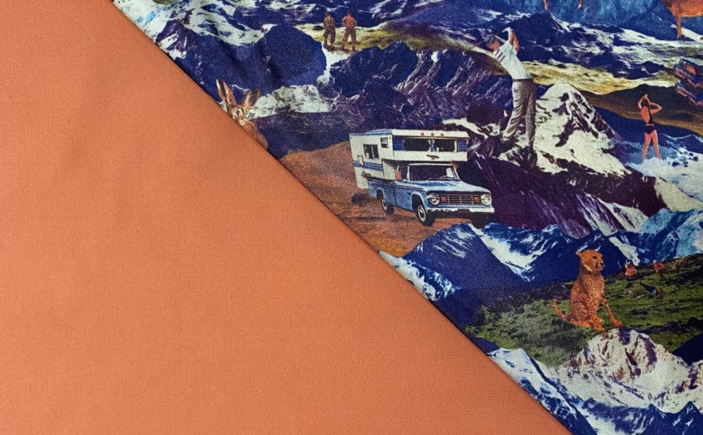
In patterned or printed fabrics, the different elements create primary and secondary colour options that you can use to complement your suit colour choice. If you prefer avoiding matching primary colours, consider a secondary tone to use. That creates a language that is consistent in your suit and lining, but still highlighting the colour differences in your lining. For example, in our pairing above, Amber Rush OP 1922 is matched with Vail OP 120, using the orange tones in the suiting fabric and lining to play up the blues and whites in the design of our Aura lining selection.
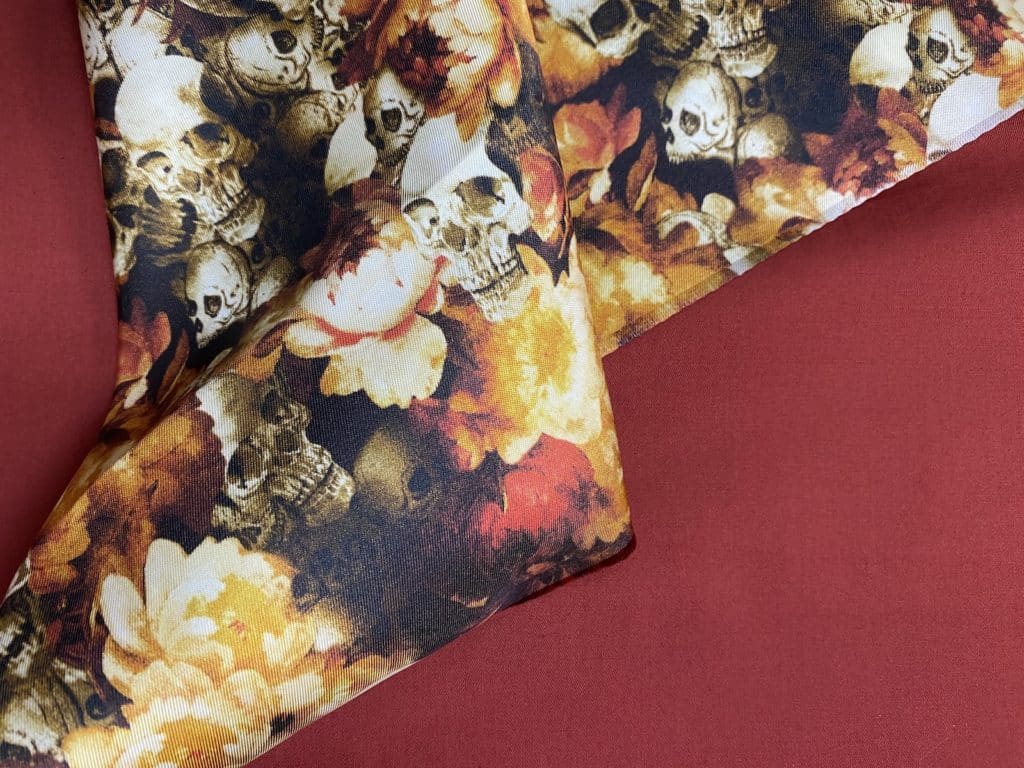
The Cherry OP 1931 fabric from Cotton collection complements the orange and red hues in Sepia Skull OP 132. Image courtesy of Namrata Dogra.
Consider similar hues
For an easy match, consider adjacent colours in the colour wheel in your suiting and lining fabrics. The similar tones in the fabrics make for a simple and effortless pairing. In the above example, the cherry red in Cherry OP 1941 blends seamlessly with the orange and red hues in Sepia Skull OP 132. Similar to that, tone-on-tone pairings can work well for a suit and lining fabric. You can consider a deeper tone for one fabric, and lighter hue for the other, to add depth to your suit design.
Bloom OP 158, in a deeper shade of blue, is paired with Aegean OP 1913, in this shot. Image courtesy of Namrata Dogra.
Feel free to mix and match
Visit your tailor and try out individual fabric pairings to find what works well for you. You may also want to consider choosing a patterned fabric with your suit lining print. Choose from great cottons in our Cotton and Linen for Everyday or wools from our A Suited Approach and Eco-Evolution lookbooks, and pick your lining designs from our Aura lining range today. Then bring your look to life with one of your partner tailors.